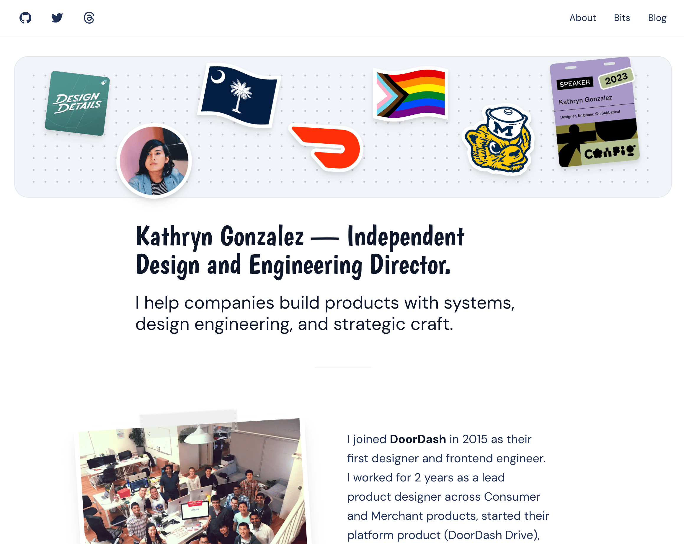
Welcome to my new website, circa 2023. I hope you like it.
One of the things that I’ve always liked about the building and rebuilding of my personal website (and I’ve done that a half-dozen or so times over the last 15 years) is the idea that it’s a reflection set in a particular time of where I am as a designer, as an engineer, and—primarily—as a person.
But over the course of a (busy!) last 8 years, a career at a fairly successful startup (you may have heard of it), a discovery of who I am, a design-systems-thought-leadership built in public, an engagement to the love of my life, and countless other moments in that time, I’ve let this website stall. This space, as a reflection of who I am, has not stayed in-sync with the reality of my life. I want to change that.
The last time I made a major refresh to this website, I was almost an entirely different person—I had a different name, different face, I was a year and a half into a new career working in startups, and I didn’t really know what I was doing or where I would go next. So now, at an oddly similar (does anyone really ever know what they’re doing?), yet vastly different point in time for me, I thought it was time to figure out what I wanted my digital reflection to look like.
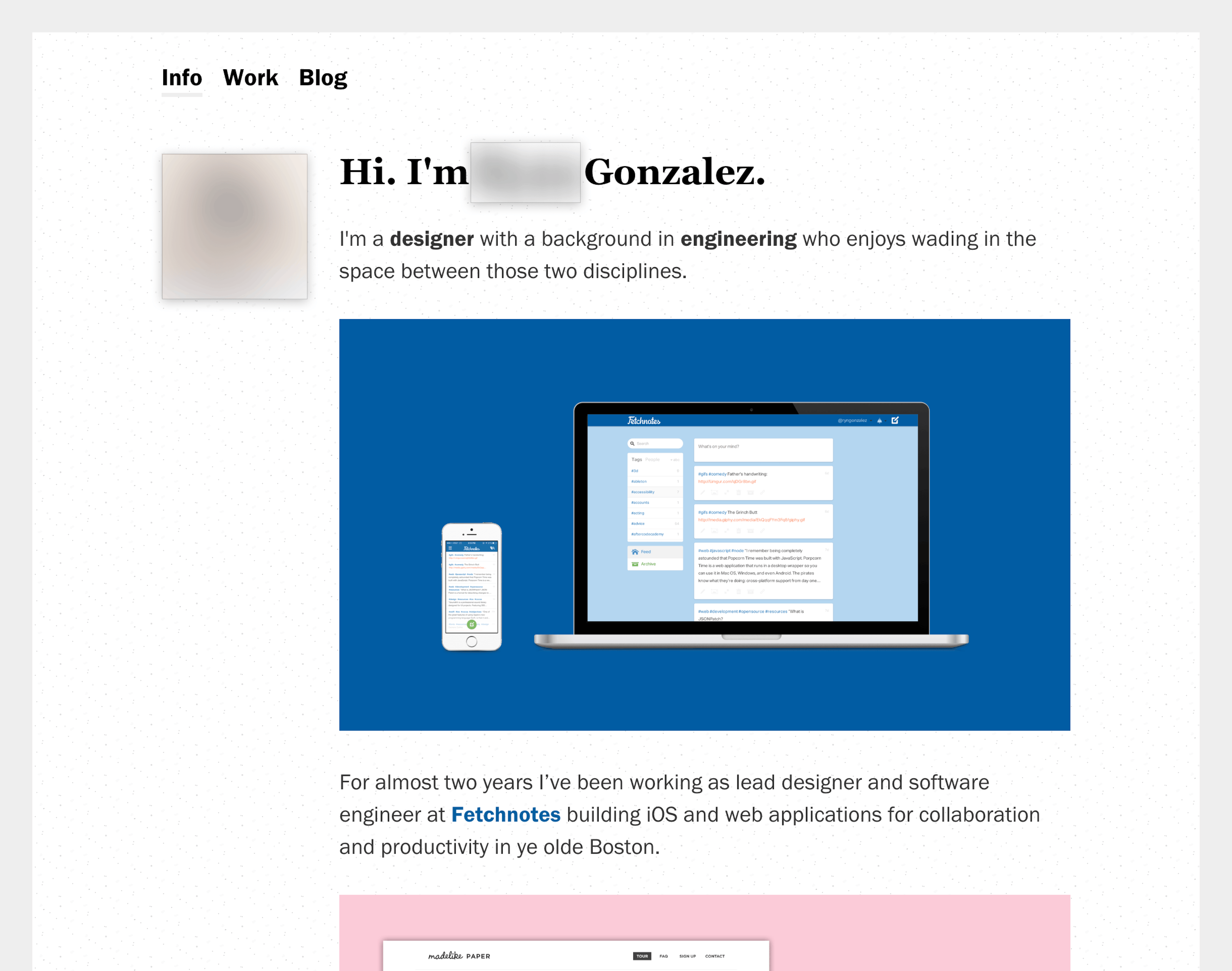
Vintage ryngonzalez.com, circa 2014-2015. Yes, you can find my old website out in the world, but the person there—it’s no longer me.
For almost 8 years, I barely changed a thing—sans a name change and a disclaimer here and there to prevent confusion from recruiters and other folks interested in what I do or say, warning them that “yes—this site is quite out of date!” When so much was changing—in my career, in my work, in how I expressed and define myself—it was always funny to me to see how slowly my website changed to share those increments.
There are moments where I wish I had given myself enough space and energy to do the work of reflecting and writing regularly—to look at the moments where I made leaps in my career (like going from an IC to a manager of managers), or in my understanding of myself (coming out as trans, and experiencing tech in that context), or in what I learned about over the course of building an unlikely, enduring company (you don’t get many $35bn, #1-at-X-in-the-world organizations like DoorDash in a startup career) with a fresh gaze.
I didn’t, and now we’re here, 8 years later. It seems like the right time to take this moment to do what I hoped for, and to share more of what I’ve learned and how I feel about the world, the industry that I find myself semi-reluctantly successful in, and the things I make from here to satisfy my own curiosities and missions.
So what does my digital reflection from here look like, and what matters to me in this iteration?
##1. Share openly and consistently
Ultimately, I want to make this space feel more lively and lived-in. More consistent in sharing the headspace, the feelings, and the ideas that get me excited, or that I find myself gravitating towards with my time and energy.
For me that means both a consideration of how the tool of this site fits in my life, but also the process and space that I give it to be a more accurate reflection of who I am and what I care about.
The tool must be easy for me to pickup, accessible as an authoring environment for me to reflect, and as frictionless as I can make it (without compromising other facets of what matters to me). It also should work for other to come to it as readers—easy and fast to access, well-considered words in a well-crafted format, and worth coming to.
Making the process work alongside the tool is part of why I built this site with react-notion-x—I wanted to work in a place (Notion) that I already use to reflect and write (privately), and that gives me the fluidity and ease of iterating that Notion does. Plus, with the power of Next.js and it’s SSG helping make the reading experience of this site fast and accessible through pre-generation of my blog routes.
With this sabbatical from tech (more on this in a later post) giving me time to reflect, I’m making use of it to build a habit and process of reflecting. Small things, big ideas, many variations on a single thread—I want all of it to be here. For now I have an inconsistent schedule to give myself time to reflect, but I aim to carve out more soon.
##2. Reflect back the fullness of me
Another aspect of what I care about reflecting in this site is the fullness of who I am as a person and professional. I don’t want to hold back from sharing the things that matter to me—my queerness, my perspective as a woman, my experience in leadership in tech, my understanding of the world from as an immigrant. To be only one thing keeps me from making this the home I want it to be.
So I want to make this space more reflective of who I am—my love of puns and cute things, my sense of humor, my ability to laugh at the absurdity of the different intersections of my life and communities while also critically examining what it is that matters as a person like me navigating this industry.
Using Framer Motion to bring life to some of the details that make up who I am! It is truly a delight to build with a tool like this to introduce fun, physical moments like these stickers.
There are different ways I’ve tried to do this so far—in how it feels as a reader in it’s structure and speed, in the fonts that I use with all their quirks, in the experiences (like my homepage stickers built with framer-motion!) that I add to it. And most importantly, I’ve done it by setting my expectations (and yours, through this) to recognize that this will not just be a blog about leadership practices, react, design systems, or whatever else you expect. It may be all of those things! But it will also be more expansive, and open beyond those familiar topics.
##3. Play, experiment, and foster a creative hunger
As I grew in my career as a manager, and especially in an organization that grew as quickly as DoorDash, I constantly made space to design, code, experiment. I did it even when I was managing managers, and the gravity of the job made finding that time more and more difficult.
Especially in this period of my career where I have the space to find roles that straddle the line between management and making, I want to be active in fostering creative learning and growth for myself. Being able to have a space to play and experiment in a way that gives me energy is a priority in this next phase in my career, and I want this website to be that open, messy space for me.
What that means is making room for the small things that I consider and learn throughout a week; an experimental space for the stuff I hack on, libraries and technology I dive into; a journal for the ideas that I consider, both personal and professionally. The little stuff, the big stuff, and the things in-between. For me, the /bits page serves this purpose!
One of my favorite talks on the act of building in the ephemeral world we live in is this talk from Clay Shirky:
He’s focused here on community, love, and the solidity of open-source.
TLDR: sometimes the most lasting and strong things we can make as people are things that change regularly, but are defined by a dedication to the process, ideas, and acts that help those things change. Shinto shrines, much like open-source, are rebuilt continually, but in that constant change, live on as something more effervescent and real.
Similarly, I’ve changed a lot over the last 8 years, since this website last changed. I’ve learned, grew as a person and professional, and accomplished so much. But in not making space to continually reflect, write, and share that change (in one place!), I’ve let the edifice of what this site is stand still. I hope, in remaking this space now, to change that lack of action.
I want this website to be a continual practice—a place that has solidity not in what it is in a given point of time, but because of the act of me learning, sharing, making, and (hopefully) inspiring others through my words or artifacts.
So—welcome to my personal shrine.
#Addendum — Inspiration
Expand to see all the inspiration…
If you want to see some of the sites that helped inspire me during making this site, check out these sites by unfolding this section below. I looked not necessarily at the visual cues exactly, but more in the way these sites expressed the personality and sensibilities of the person on the other side.
Additionally, some of this inspiration may be influenced by my admiration and respect for the person rather than just the site itself.
- Inspiration from other personal websites:
#https://asuth.com/
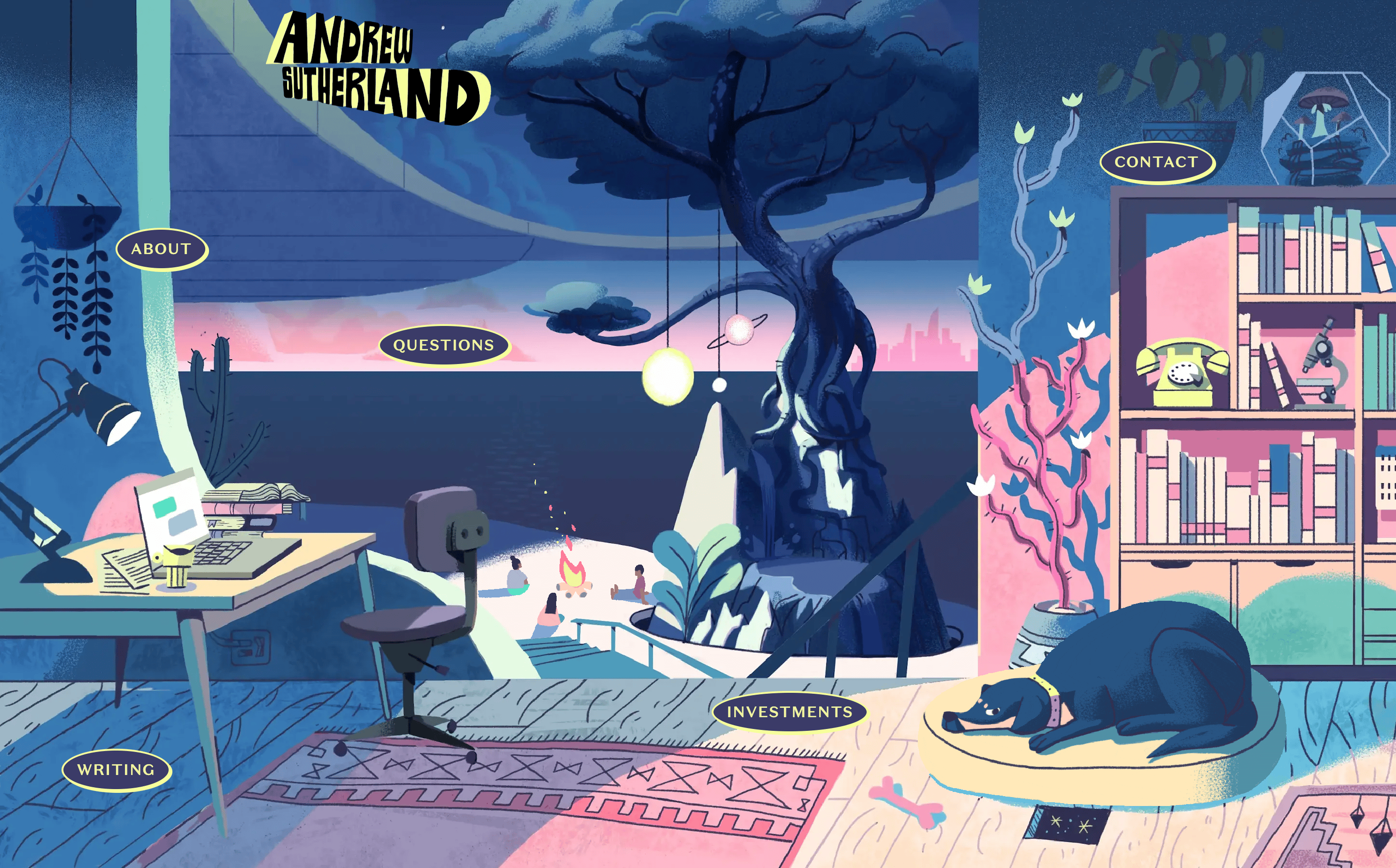 Andrew Sutherland’s website is so fun. I don’t know if he did all the illustrations himself, but the way they move, the liveliness of it, alongside the way he writes—his site makes me smile.
#https://www.jina.me/
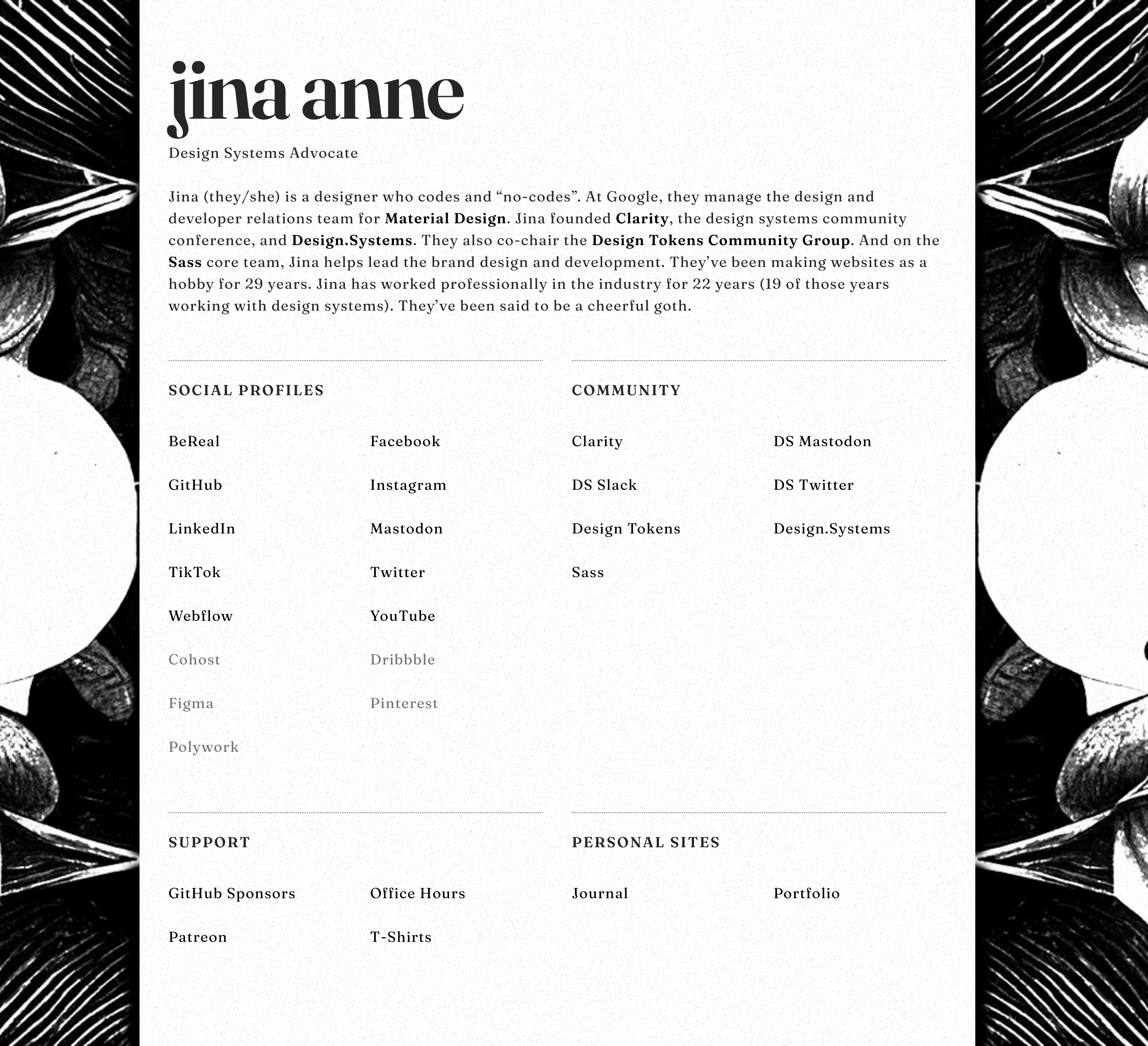 Jina’s site is straightforward and unapologetically her—clearly written, all black, and showcasing the wide-breadth of her presence and impact on the broader community.
#https://leebyron.com/
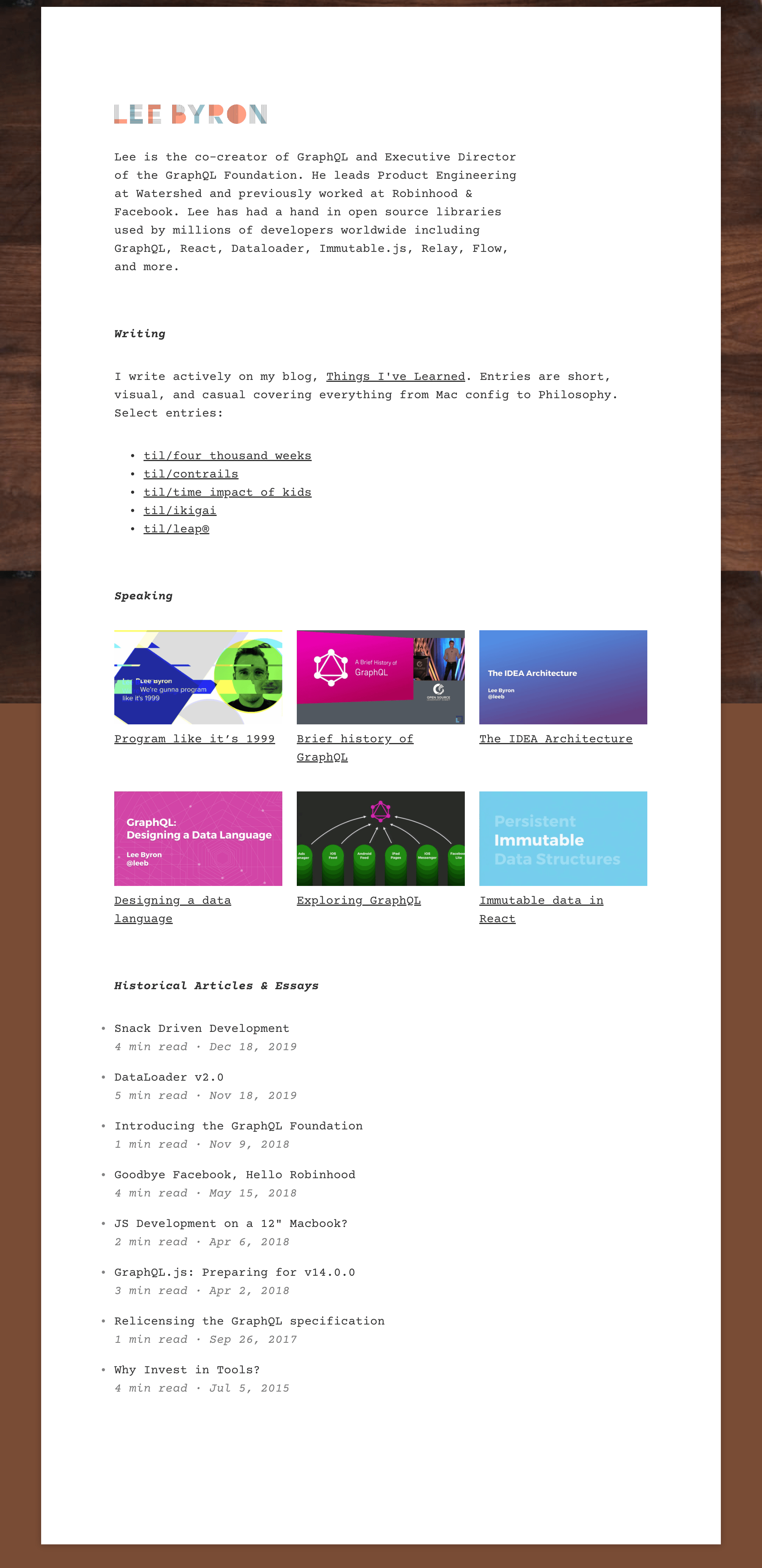 Lee’s site is understated, but he does bring some delight through scroll-driven animations, alongside straightforward writing that I respect. He’s the kind of person that I want to emulate in my career, as someone that has somehow straddled design and engineering.
#https://maciej.co/
 I don’t know Maciej very well, but I was excited about the way he expresses himself in his personal website. The level of motion, color usage, and the block structure he employs is well executed and I love to see what he’s done.
#https://mattjlew.com/
 Matt was the first person I ever hired in my career (as my design systems partner at DoorDash), and as someone with an exceptional eye and ability to execute visual design, he’s someone I greatly admire. His understated design and focus on typography in his site makes his calmness and clarity as designer shine through.
#https://www.nan.fyi/
 Nan’s ability to distill technical topics into something visually engaging, easy to follow, and effectively interactive is awesome. There are quite a few things I’d love to share in a similar format and his work on his blog is one I’m certain to get inspiration from.
#https://turman.co/
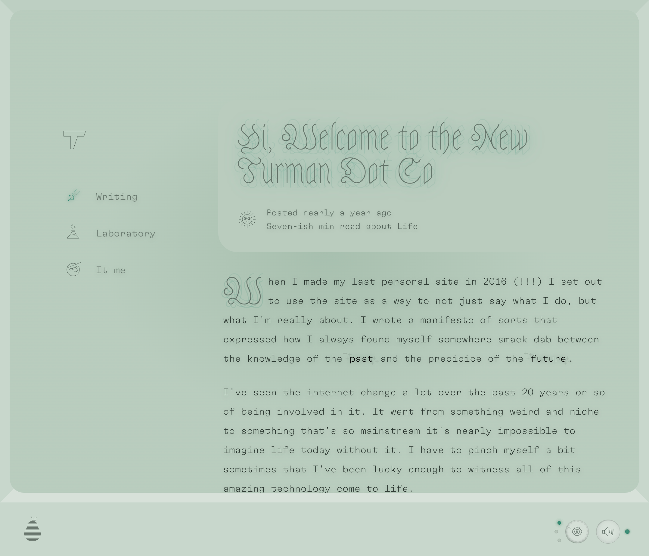 Kyle is both a wonderful human and a talented designer/engineer/leader. His website is such a breath of fresh air (what other website have you seen lately that has bespoke music set for it?) and carries his strong writing in a beautiful way.
#https://samuelkraft.com/
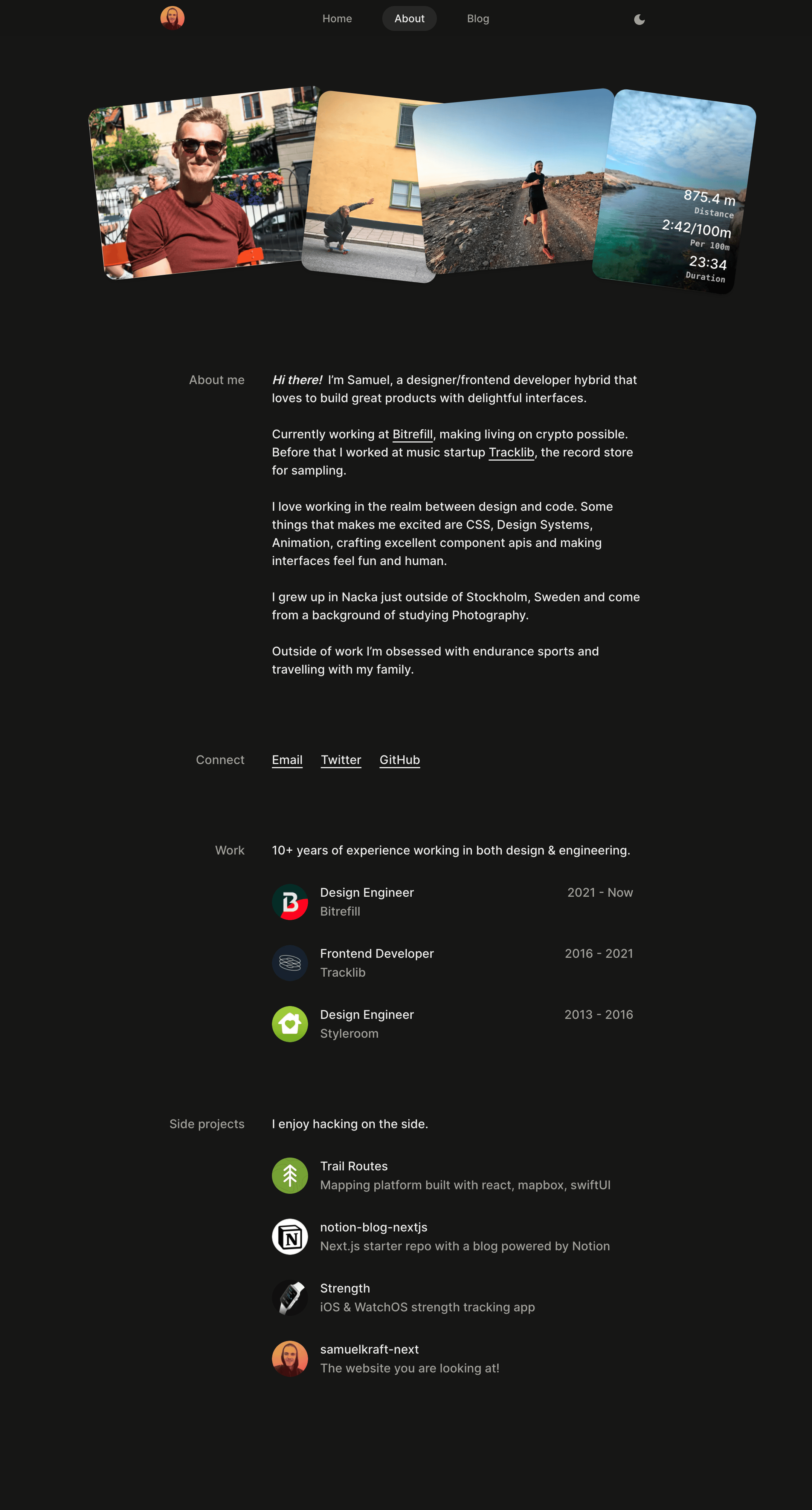 Samuel has some delightful interactions leveraging
 [framer-motion](https://www.framer.com/motion/?gad=1)on his site, alongside very clean typography and layout. Love his attention to detail and what he’s built.#http://petter.pro/
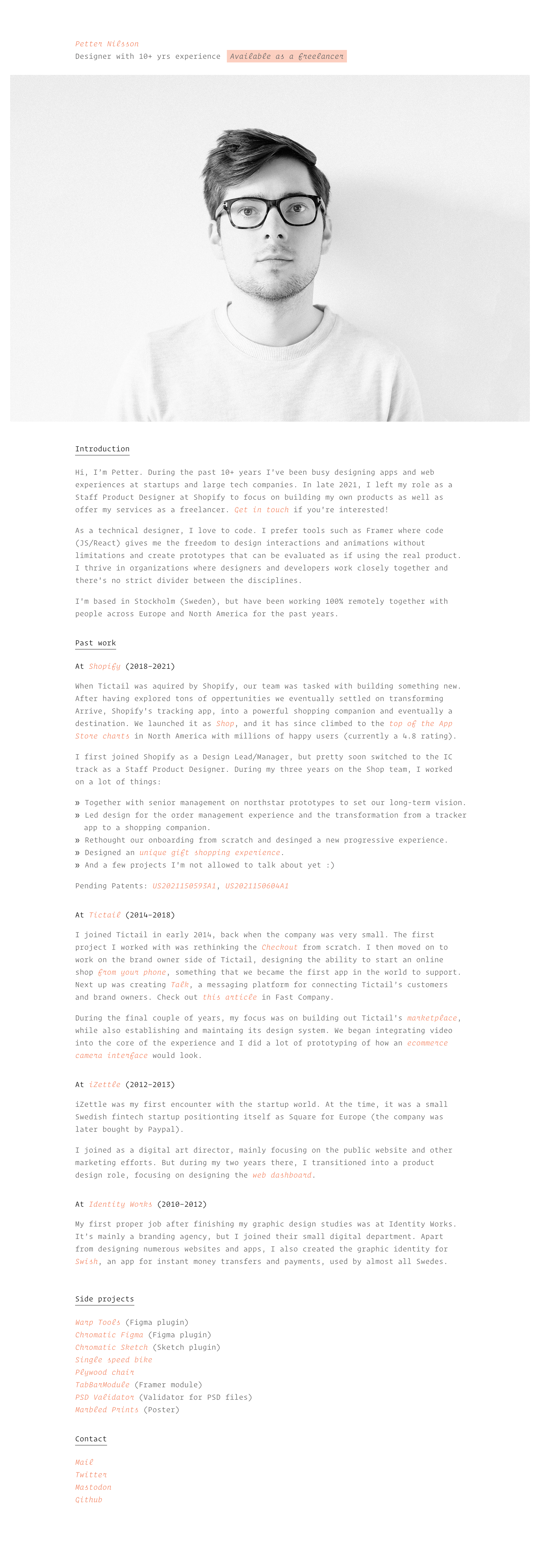 Petter has a very simple, text-driven site that is so effective. Two colors, left-aligned, one font-size. It’s an exercise in restraint that I respect and admire.