*Howdy. This is the first in a series of posts taking on some specific design problems from cool companies doing interesting things. I’ll break down the problems and work through a process of coming up with a solution or two. Keep in mind that most of the work done here occurred in drips and drabs over a couple of days.*
For the first go, I decided to write about a quick weekend re-design of the search experience for DoorDash, a company out of Palo Alto which is trying to to empower small businesses to offer delivery in an affordable and convenient way. They contacted me and asked for some help thinking about the problem, and I threw some work together. Below are some thoughts on the problem, process, and a peek at a first iteration of a potential solution. You can find all of the assets from this project here.
You can find more of my work at ryngonzalez.com.
Design is the process of deciding how something should be. When you’re a product designer (which doesn’t necessarily mean you have design in your title), you have a particular perspective on a problem, and your perspective shapes how you tackle the corresponding solution, which includes but is not limited to the products that you’re creating. Every smart & stable organization has a singular perspective on how they go about their work, a perspective that is the aggregate and result of all these internal viewpoints coming together (through fire, brimstone, and high-intensity discussions) into something coherent and visible from the work that they put out in the open.
As an outsider trying to design from the perspective of DoorDash, I needed to make a few assumptions about how they see the world and the problems at hand.
#The macro-problem: enabling small businesses to easily offer delivery.
#The micro-problem: helping customers find what they want delivered.
Here’s what I came up with after reading up on their work and chatting a bit with them:
- Smart operational, technology, and design choices lead to a better experience for both the customer and the small business.
- How can you design the customer experience to enable better operational efficiency? How can you design the operational process to enable a better customer experience?
- Discovery, delivery, and usage are all steps of the overall experience that must be designed with intention on a holistic level.
- Each step affects the other, and problems in one step should be solved by considering changes throughout the system as a whole, not just isolated in one area. Design with the idea that you can change more than the customer facing interface.
These are the points that helped orient my thinking while designing a better search experience for customers. I spent a few hours this past week doing some writing, sketching, and prototyping and came up with a thing or two that could help solve this problem.
Anyway, let’s get on with the show.
The current DoorDash experience for searching and selecting something you want delivered to you.
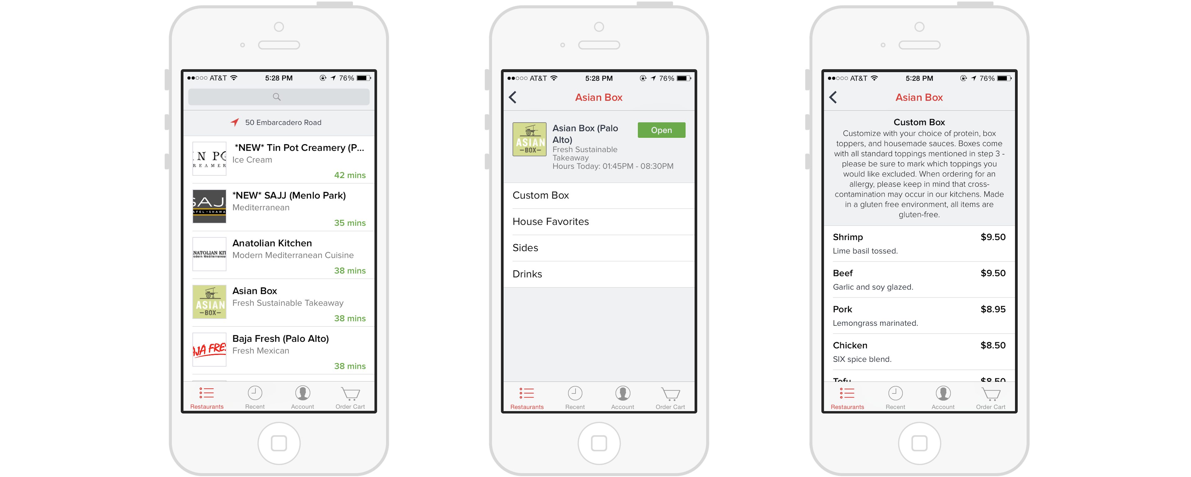
#DoorDash Search: What we have now
Before I get into the meat of things, I’ll just say that the modus operandi here is avoid straying too far into unneeded ratholes like updating the visual style, working on iconography that’s pixel perfect, or obsessing over inconsistencies between different mockups (not a priority), while ignoring the problems that we set out to work on.
I’ll just point out the visual aesthetic in play so that I don’t have to explain later: the interface is simple, sticks closely to the iOS design guidelines, and uses a few custom components that don’t stray too far from what’s established. Red and Avenir provide a slight veer from the standard. Photography is limited to small squares for each restaurant’s branding.
#Current issues
As for navigational and functional issues, here’s the current state of it from the horse’s mouth:
Right now, we simply show a giant list of all the restaurants within a specific radius that the customer can order from. This obviously has several drawbacks. It scales poorly if you have lots of restaurants, e.g. 1000+ menus. It’s also very hard to discover new restaurants — usually you have to know the restaurant beforehand or pull up Yelp at the same time.
Put in another way:
Search in DoorDash right now is a blunt tool for finding food from places that you know, rather than a sharp tool for finding exactly what you want to eat based on your context or mood, without you needing to go outside the app for recommendations and ratings. It throws everything it has at you, with no curation or organization (intuitive filtering by category doesn’t exist), and very little signposting (like the quality of a restaurant, the average price, the ratings of individual items) to help guide you when making a choice about what you’d like to eat. The onus of finding what you need is on you the customer, rather than on the service and interface, and there’s a lot of improvements that could be made to shift that responsibility*.*
#Order process
Right now, picking an item to order is a 3 or 4 step process (dependent on if a given restaurant has multiple menus):
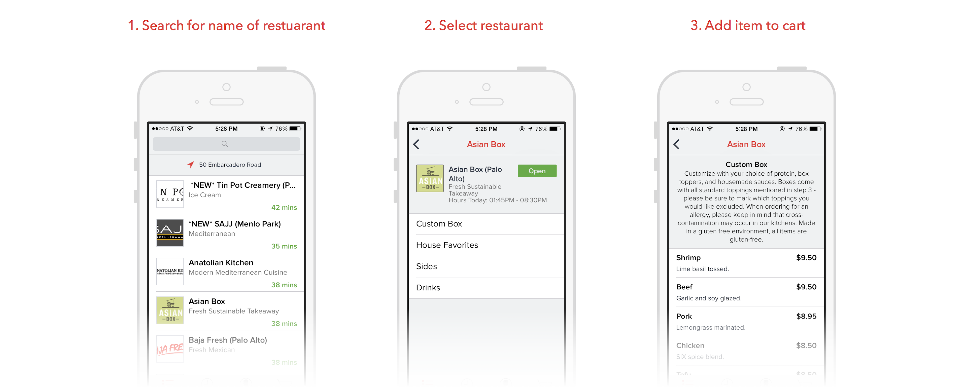
The search is business-centered, vs. item-centered or a hybrid of the two. Even if you knew exactly what kind of meal you wanted (say a large tabouli salad and some falafel) you would necessarily need to find a restaurant that would serve that first before you could add it to your cart, and then drill down into the restaurant’s menu to actually select it. For now, the service is not taking advantage of the fact that they have access to item-level listings to greatly increase the utility of search, and that they can use their data on what people are buying on a per-item level to drive an increased push in recommendations.
#Search
Right now search acts on two properties of a listed business to help a user find it: the name of the business and the single category of the business. This leaves you four ways to find something you want to eat:
- You know a place that serves the dish that you want, and search for its name.
- You know a place with which you’ve had good food in the past, with dish TBD, and search for its name.
- You search for the category of cuisine that would likely serve a given dish.
- You search for a general category of cuisine that you’re in the mood for.
While this can be useful in some cases, there’s still a large burden on the user to know what’s good, and too little guidance on our part to help facilitate this decision making process*.*
So, that’s where we’re at now.
#1. No organization, curation, and recommendations
#2. No signposting for comparing and contrasting different restaurants and items
#3. Not taking advantage of itemized search and discovery
#Process
For me, a lot of design is about writing. I write to give a structure to errant and passing thoughts that I’d otherwise miss. As thoughts come, I put another leaf on my project outline so that it’s connected to what came before in an organized set. It’s like thinking out loud manifested on paper: it gives me a third party viewpoint with which I can look at and analyze my ideas, and to think in a more critical way about them. A space for metacognition. It’s a medium the lends itself to rounding out the understanding of a problem, and it’s invaluable to me when I’m trying to capture the shape of the problem space or some ideas that I could use to tackle it.
On the flip side, I usually have a notebook for sketching by my side while I’m trying to flesh out my outline. It’s the free-form place where I can explore, mess up, and just come up with the shape of ideas wacky, obscene, and potentially useful. To me, writing and sketching are just two sides of the “trying-to-figure-out-the-problem” phase.
#The Organizing Principle
The thing that I wanted to explore and design first was the idea that the items and businesses could both be equally positioned as things to be searched for and presented: a design that would show you restaurants and items in a set of search results, rather than just surfacing restaurants and forcing you to drill down to find the dishes you wanted.
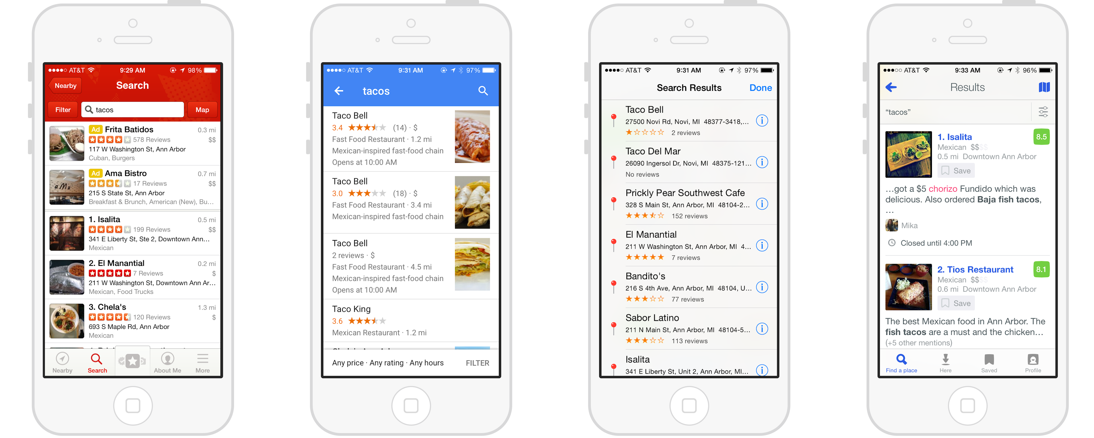
When you go to the DoorDash app right now, you’re thinking about ordering in the same way you would think about selecting a restaurant to go eat at in person: it’s the Yelp-Foursquare-Maps-Model.
Yelp, Google Maps, Apple Maps, Foursquare search results for “tacos”.
But DoorDash is in a special position in that it knows about the individual items that a restaurant serves, knows stats about each individual item (sales, ratings). Those items are the actual things selected for delivery at the end of the selection process, and the restaurant that provides it simply helps guide someone towards that selection. So, what could an item-centered search and discovery experience look like?
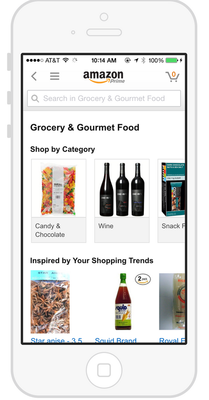
Amazon’s search and discovery is centered around individual items. Sellers are de-emphasized in this scheme.
In an item-centered approach, there’s no need to select who to buy from, only what you want to buy. Sure, the information about the given seller can be found once you click through to the details about the item, but it’s merely used as a point of comparison, a component of signposting once they’ve picked out what they’re looking for.
I think there’s a middle ground to be had here. With an item-centered experience, the small businesses DoorDash aims to help are de-emphasized in a way that could be destructive: they could become faceless sellers, disintermediated from the selection experience entirely. This isn’t something that aligns well with DoorDash’s aim and also removes the restaurant as a signal of quality, so it’s not a viable move to shift completely to this model. So how can we utilize the advantages of both an item-centered approach (speedier ordering, sharper search results, and item-level signposting) and the restaurant-centered approach (better for browsing, better for discovery, better for our restaurants) in some sort of hybrid model?
Here are the rules that oriented my approach:
- When displaying item listings, provide important context about the restaurant providing the item. We don’t want to make the businesses we serve faceless entities. For any item we want to provide that information as more signposting that will help ease the selection process.
- Item listings should be actionable. The magic of an itemized listing is that you can provide a shorter path to selection and ordering. When you see an item in a collection or list, you should be able to easily get it into your cart.
- Mix items and restaurants in a smart way, but allow for refinement down to each mode individually. We shouldn’t be afraid to serve both types of result during a search, but we should build in ways to drill down into each type of result to allow for a more accurate search.
#Signposting: “What’s good?”
Now that we have the organizing principle set, we can focus on a couple of the lower level problems: lack of signposting for comparing items, lack of organization of items for a more meandering process of discovery, and lack of recommendations to help guide a selection process.
#Signposting: reviews
How do you figure out what’s good to eat? What’s the metric (or metrics) that help indicate and guide you as a customer? In the current DoorDash, there’s nothing except the title and the category of cuisine that can help shape how you pick what to order and where to order from. User feedback, in the form of user reviews or photos, is non-existent.
Signposting is interesting in that some signals are inherent to a given item or restaurant — it is this category of restaurant, it will take this much time to deliver — and can’t be changed based on user feedback. Other signals are quantitative and changed implicitly and explicitly by what a user does.
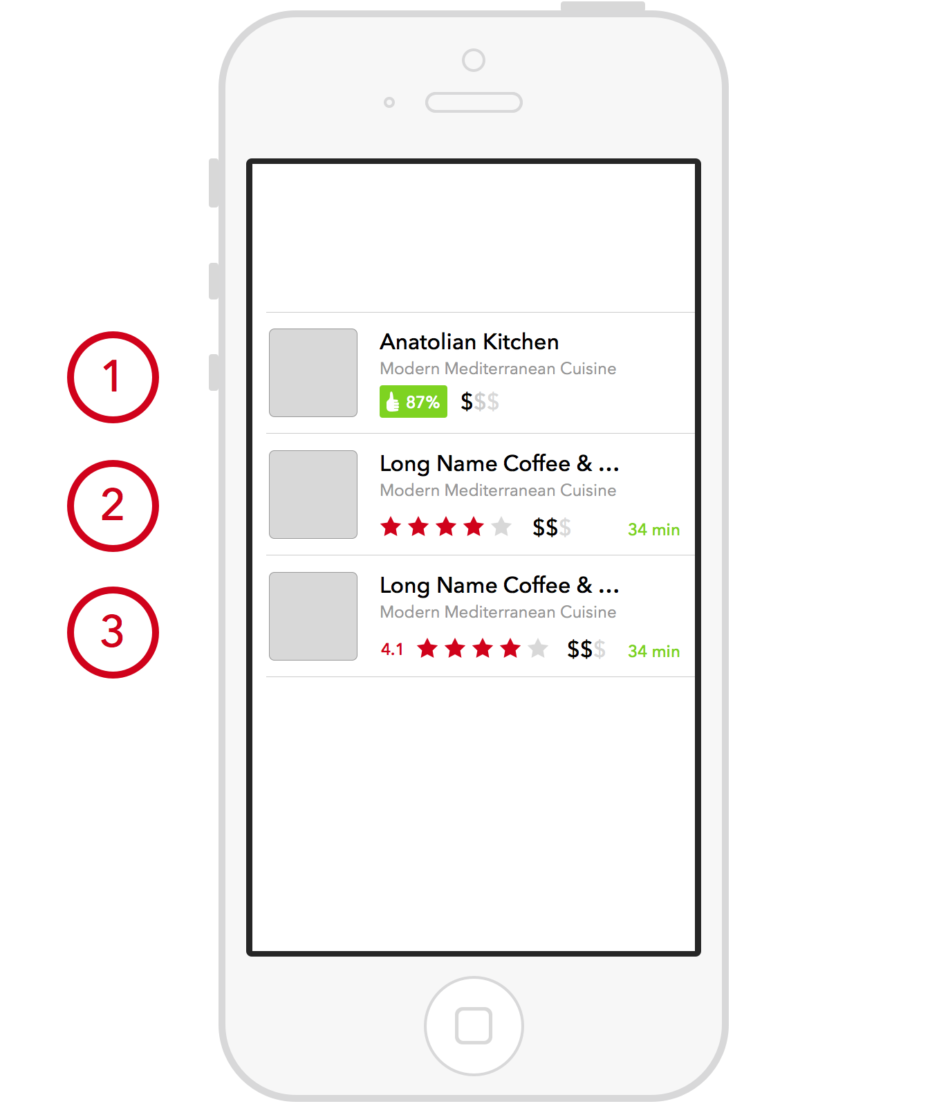
A couple iterations of restaurant listings.
Here, I took a few sketches and my hunches about what’d be useful to a customer looking for a good restaurant to order from; each iteration is numbered, with #1 being the first.
When someone is looking to compare restaurants for drilling down into, they’re going to be looking at type, affordability, rating, and delivery speed. Gathering and displaying type information is easy, it’s all the descriptive information that the restaurant provides itself. Normally, average cost is something decided by the restaurant or explicitly set from user feedback. One cool thing DoorDash can do that others can’t is provide calculated average selling price from the orders that each restaurant fulfills. That means we’re providing a more accurate gauge of affordability, and a shorter step in either the restaurant signup or user feedback process. That’s a win.
Going through this, I wanted to figure out what our key comparison metric was for user feedback, and how we would represent it as signposting. Initially in sketch #1 above, I had a vague “satisfaction score” that was displayed as a percentage. I didn’t know what exactly that measure would correspond to, and what it really indicated. Identifying the key unit of measurement here was important: when does someone provide feedback, what are they rating, and how do we prompt them?
There are a couple of options here. We can ask for feedback on the quality of an *delivery (*which maps 1-to-1 with a restaurant, since you can only select from one restaurant per order), we can ask for quality of each individual item, or we can ask for a combination of the two. What I first came up with is on the left: when an order completes, you receive an email with your receipt, and the next time you open up the DoorDash app, you’ll see the feedback view from your last delivery (if you haven’t rated it already via the web user feedback interface from the email receipt). Like Uber or Lyft, DoorDash has a clear view on the state and process of delivery, and knows when it’s completed, and has the ability to present a request for feedback at very apt times.
And a good question to ask is: will user feedback be most accurate immediately after completion of delivery, or after some other time? Unlike an Uber, for example, the DoorDash experience doesn’t quite end once a delivery is fulfilled: you still have to see your food and eat it before you can say whether the experience was good. One way Amazon takes user feedback for an order is by staggering a request for feedback a few days after delivery — it gives you a chance to actually use the thing you ordered and see if it suites you. For DoorDash, we could stagger the request for feedback as well on a shorter timescale, since (good) food doesn’t last very long after delivery. So waiting to ask for feedback (via email receipt, or a push notification to prompt you to return to the app), in a half-hour after delivery, should be appropriate.
In the scheme above, each order has a rating, and each item from an order can have a rating as well. This takes advantage of that fact that items can have signposting as well, for when they’re displayed individually or as items within a menu of a restaurant.
#Signposting: Photos
One key thing missing here is photos. Photos of each restaurant, while good indicators of quality and category, are less necessary for DoorDash listings because a customer won’t be going to the physical place — there’s a disconnect between what’s shown and what a customer will experience. One thing to consider: on the restaurant side, owners might prefer to have pictures of their locations to entice customers on DoorDash to come visit in person; just another reminder that we’re designing for more than just the customer ordering their food, we’re designing for the customer who’s using our service to help enable them to offer delivery. If we can keep the quality of both sides of that relationship high and improving, then a design decision like the one above is more easily justifiable.
Something possibly more useful would be to display a collection of photos of delivered items — these are the kind of things you’ll get when you order, and the photos of those things are perceived as a good indicator of their quality.
An initial interaction is to the left. A horizontal carousel of photos for items served by the restaurant is displayed at the top of a restaurant’s details page. Tapping on a photo will expand it and display information about the item — you can even add the item directly to your cart from that view.
A huge question that we haven’t touched on yet: where do we get these photos? On one hand, we can request this during the user feedback process. People like taking pictures of their food, right? Well, one issue is that food packaged for delivery might not be very attractive looking; there’s less of a incentive to take a picture, and less of an impact on someone scrolling through images of food presented in a utilitarian way. So, I’d recommend requesting restaurants to provide photos of each of their dishes. More work on their end, but a much better experience on the customer-side.
#Signposting & Item Discovery on Restaurant Page
We’ll start moving towards the homepage and the center of search and discovery. Before we head out, I’ll point out some lessons and improvements from the rest of the signposting section applied here on the restaurant page:
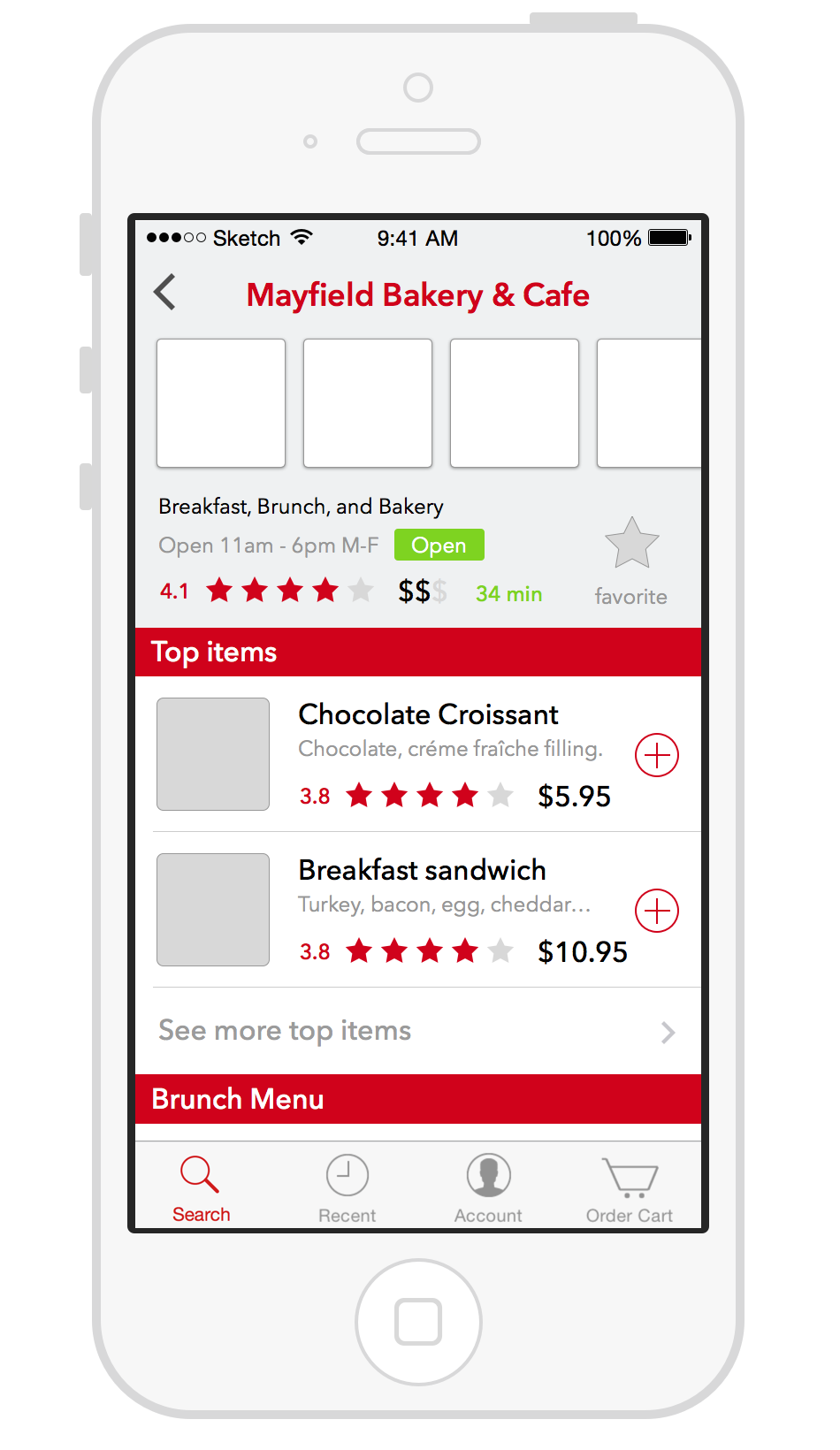
There’s a couple of important things to note here. In the current version of DoorDash, restaurant pages are sparse, and act as the root of a menu — you work your way down through different categories and sections until you hit an item, which you then tap to configure (even if the only thing to configure is special instructions for preparation) and add to your cart. Here for any item being selected, unless there’s a set of options to modify an item, we’ll just add it immediately to a customer’s cart, instead of breaking their context and sending them to a configuration screen for every single item even if its not needed. Throughout the page, more static details are presented, more signposting is available, and people can even add a restaurant as a “favorite”. This can enable super quick ordering, as we’ll put access to these favorites on the main discovery homepage.
With an increased focus on providing easier access to the items that you’re looking for, we’ve added an auto-curated section within each restaurant page that presents a couple of the items that we recommend. The mechanism for picking and ordering these items is left undefined — “Top items” is just a label that doesn’t indicate much. There are numerous recommendation strategies that could be presented at that pages, and each could be presented to a specific customer or a subset of them. One example that could be used is a strategy primed for batching like items together into a single delivery run for a courier or a production run for a cook. Say DoorDash has just taken in an order for a “Chocolate Croissant” from Mayfield Bakery in Palo Alto. Someone else is looking at Mayfield’s page: what we’ll do is present “Chocolate Croissant” as a top item for anyone visiting that page within a certain time period prior to pickup of the original order. We may even present the item with a discount to encourage customer to add it to their order. Regardless, the specific algorithm for selection isn’t important. The introduction of algorithmically generated lists of items or restaurants as ways to increase operational efficiency and customer selection as a key navigational element of DoorDash’s discovery process is the most important thing to take away.
So. That’s the signposting strategy.
#Discovery: browsing & search
Now that we have the foundational elements in place, we can talk a bit about discovery. How do you find what you want, when you’re somewhere on the spectrum between “I know exactly what dish I want” and “It’s 6pm, I’m tired, and I’m looking for something nice and spicy”? It’s a tough nut to crack. Whole swathes of companies have risen and fallen trying to solve this problem, and it’s certainly not one solved with any finality at this point.
That said, I’m a big fan of the approach and execution of Foursquare: there’s a simplicity and accuracy to their tip-based, token-extracted search model. “What the heck does that mean?” I hear you say.
Let me explain:
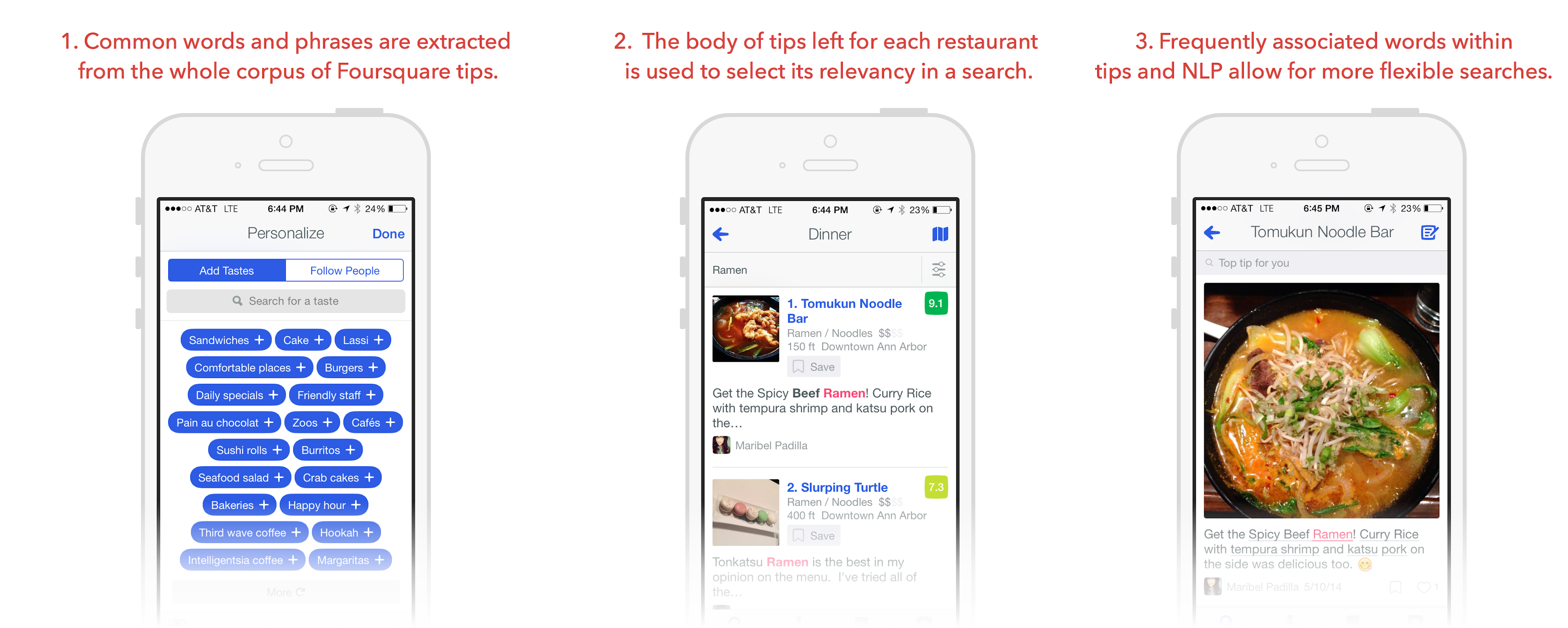
Foursquare is uncannily accurate and able to find something desirable, even if the user is starting from a fuzzily described starting point. It’s search is flexible, powerful, and contextually sorted — it knows what you like (based on your check-ins, tips, selected tastes) and can float those results that fit well to the top.
Foursquare’s accuracy is built on the mountain of tips and check-in that it’s gathered over the years; it is highly unlikely that you could replicate the execution of a system like this without a lot of patience and an excellent strategy to encourage an unusual amount of reviews to be added (cough competing for mayorships with friends cough). For item level reviews, this could be even harder to get good tip coverage. Very few people I assume (danger!) will rate more than one item in their order. So how can we bring a more effective DoorDash search experience knowing this?
#Halfway there with item-by-item descriptions
The key thing that DoorDash has that Foursquare doesn’t is, again, knowledge of the items being sold through its system. It has descriptions of what these things are, data on how well these things sell, and knowledge of who buys them. Every time that someone uses DoorDash, they provide more context about the shape of what they could like in the future. This predictive quality is useful for recommendations, and the item-by-item descriptions of items being sold in the system can be used to construct a scheme for effective searching.
One key thing to understand here is the possibility to use the information given at the restaurant level (type of cuisine, name of restaurant, average restaurant score) to map and surface item results, and information given at the item level could be use to surface and find restaurants that fit the search. For example, say you know of a wonderful place that serves lots of delicious ramen, and lots of orders for its different ramen has been delivered through DoorDash. It doesn’t have “ramen” in its name, it doesn’t have ramen in its description, and there’s no information on the restaurant level that it sells ramen. However, we know, as DoorDash, that it sells dishes with “ramen” in their titles, how many of those dishes it lists, how good those dishes sell, and how well those dishes get rated. With those signals, we can relate a query with a restaurant based on the information its inventory of items provides. And it goes the other way as well: search for “thai noodles”, and you should be presented not just with restaurants categorized as “Thai” and serving dishes with “noodles” in its name or description, but also with direct links to those dishes, even if they’re not directly tagged as “thai” cuisine — they simply inherit their type information from the restaurant that sells it.
Here’s some of those ideas in mocked-up form:
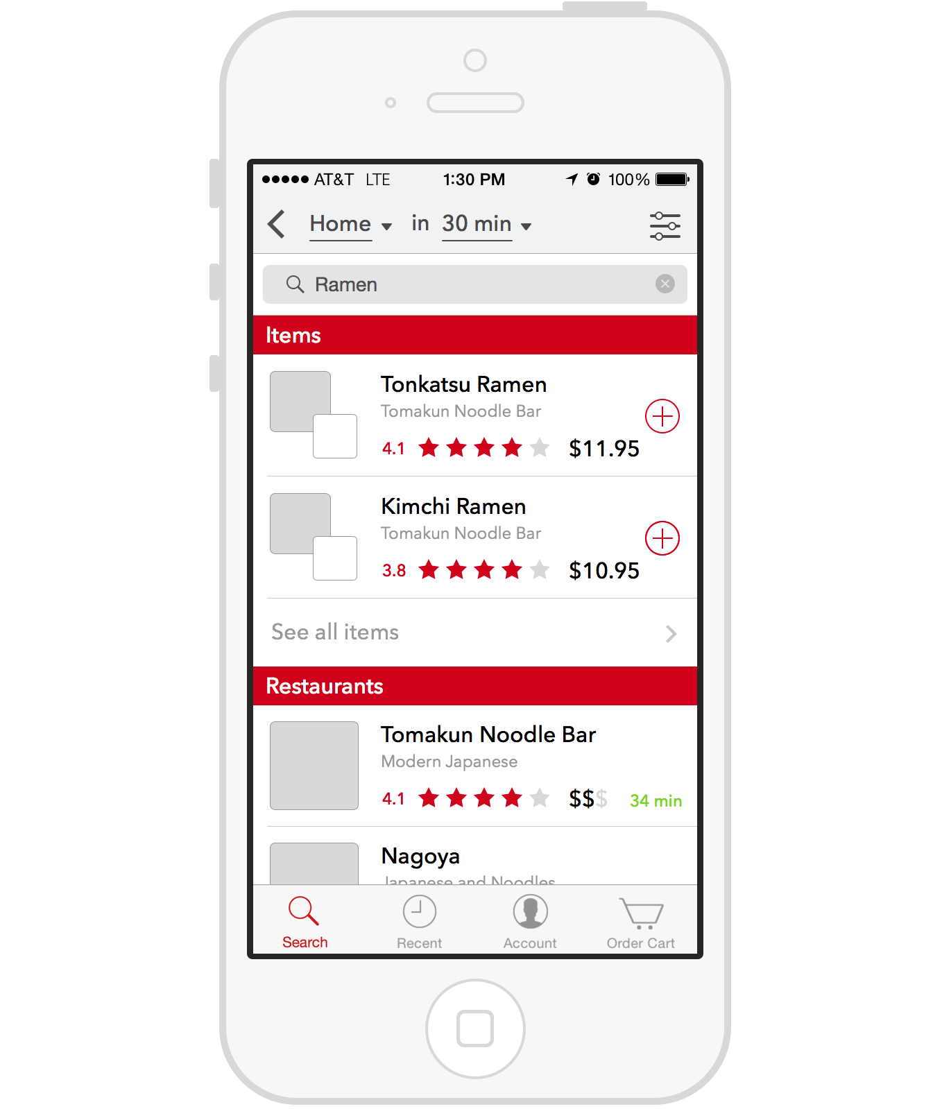
Here, we have the search results screen; anytime you do a search, you get a set of items and restaurants that map to your query, using the scheme from above. When you tap into each section, you can filter down into just the matching category: just items or just restaurants. For the restaurants section, we’ll have more results on this initial page, since they’ll be below the fold. For items, we’ll display more information about the restaurant providing the dish for sale: the logo will be in small in front of the selected photo of the dish, and the name of restaurant will be presented below the title of the dish.
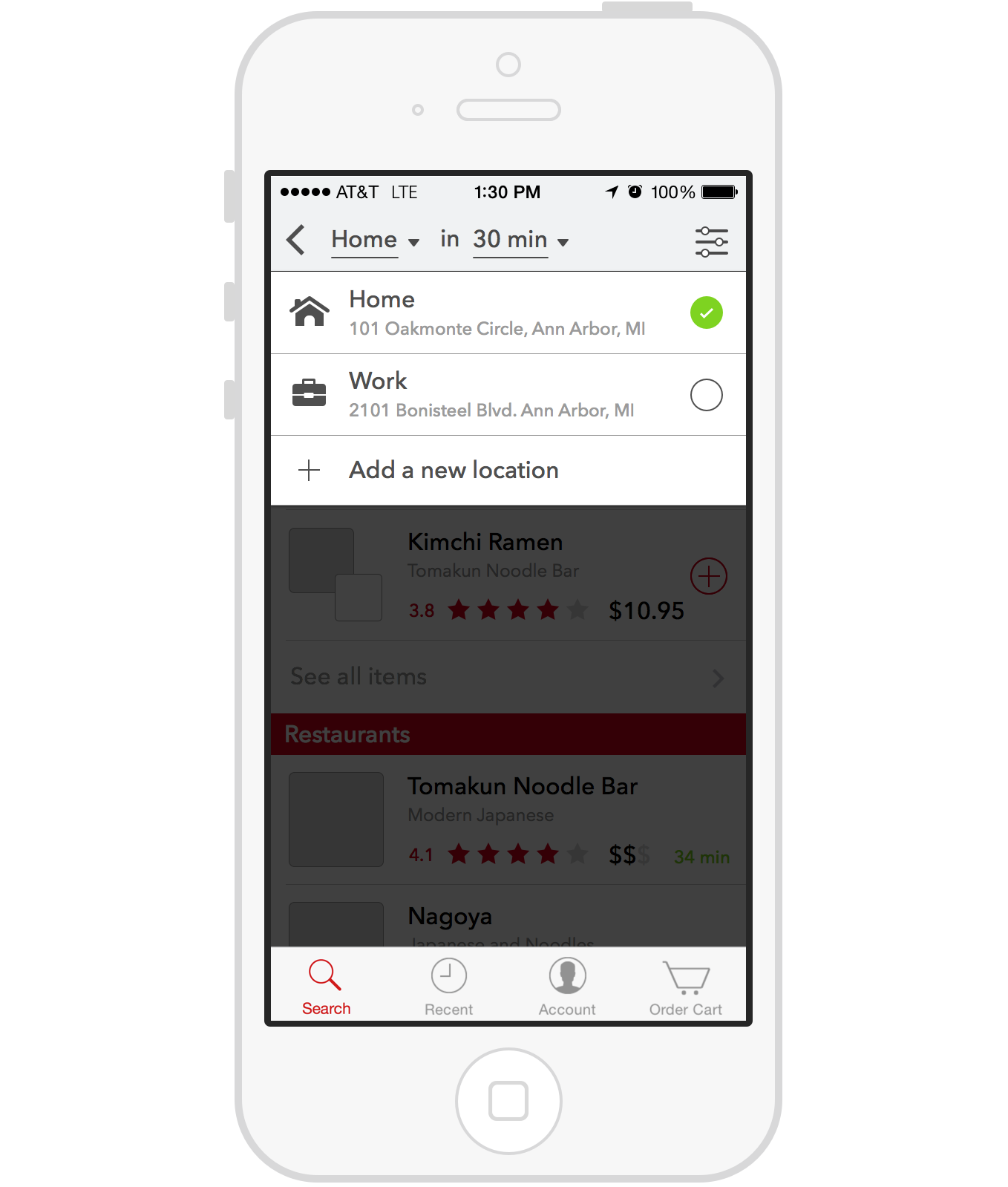
On these search pages, we’ll provide filtering controls that allow you to narrow down and exactly the food you want, and at the place and time that you need it. You can select a saved address to be delivered to, or you can go add a new address (defaulting to your current location). We also provide the ability to filter by the average pricing of a restaurant.
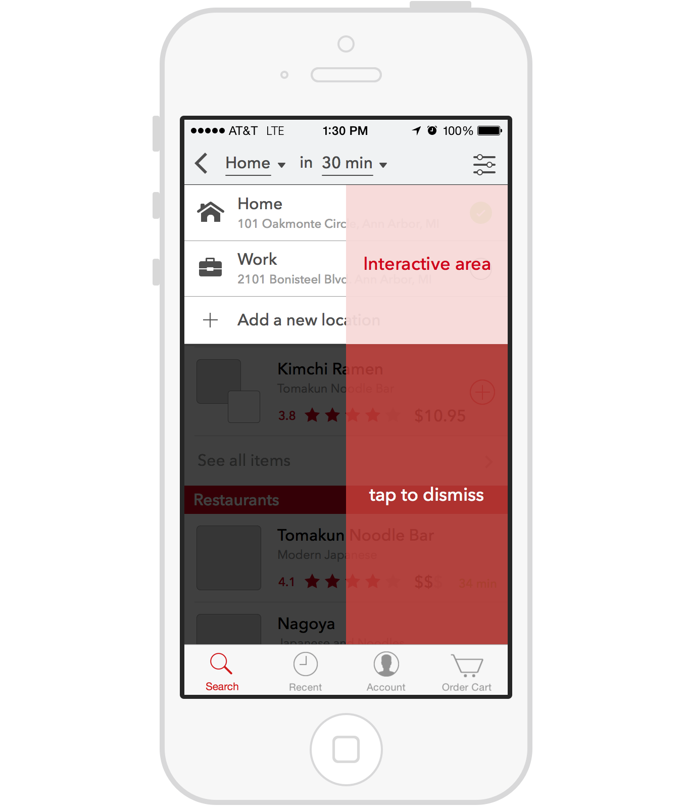
Each of these selectors (for location, time, and filters) are displayed in a dropdown interface that preserves the context of the search, and a large, tappable surface (the dark overlay) that can be tapped to easily return to the search. It is more connected spatially with the element and action that triggered it’s opening, and in turn enables a short reach to select any of the options presented— unlike a standard UIActionSheet that appears from the bottom of the screen.
The dropdown interaction described above is easier to grok once you’ve taken a moment to watch it being played with, or played with it yourself. I’ve embedded a video below for you to check it out.
Location selection, delivery speed filtering, price and category filtering.
All of the prototypes presented here were built with Framer.js — it’s my tool of choice for software prototyping (particularly of the mobile variety) at the moment. It’s important to note what the point of using these tools is: I’m trying to communicate to you, dear reader, and to communicate an interactive experience, it’s not very helpful to just throw you static mockups and a textual description. So why Framer, against the field of other tools like Origami (Quartz Composer), Form, Pixate, et cetera? The point of this prototyping is to communicate as efficiently through as close an approximation as possible, and there’s a careful balance to play between using the right tool for the job and the right tool for you as the prototyper — if you can build something fast that communicates well what you aim to say with any particular tool, then use it. I know how to code (I studied and still practice as an engineer) and I can communicate what I want to with Framer. So it’s my comfortable spot, and it doesn’t limit what I want to say (or hasn’t so far).
So, in summary on the search experience:
- Find items and restaurants based on connected properties. Find restaurants and items based on the more than just the names and descriptions of each — each item can be found with partial phrase matching on any of the properties of the restaurant that owns it, and each restaurant can be found based on the names and descriptions of the items that are part of its inventory.
- Both items and restaurants are surfaced in search results. Whenever you make a search request, you’re not restricted to just looking for a place to order from. You can search and find exact items that could satisfy your query. Easier access to adding these items to your cart makes it much easier to get an order started.
- Provide sharper tools to help you find exactly what you want. The addition of filters for price and category make it easy to narrow the search space for something you want. Improving the modification of delivery location and setting of delivery time filters makes it easier to set the context for your order.
#Browsing, recommendations and guided access
Search is a sharp tool for when you have a good idea of what you want. For every other instance, when you’re more unsure of what you want and browsing around for something, we need to provide guided access in recommendations of various types:
- Recommendations algorithmically generated from past preference. We can present items or restaurants that are found based on past rating on items, saved favorites, past orders, and the likelihood you’ll rate the recommendation highly.
- Recommendations based on context, like current time of day. If you’re on DoorDash, we should present you with a way to access the most relevant results as soon as possible — and one easy way of doing that is to present the categories that are most relevant to you. We can present based on time of day (for instance, “best breakfast” as the first category you see), and then show other categories that we find as relevant to you: eat a lot of Southern food, and have provided good ratings for what you’ve ordered in the past? We’ll feature that category.
- Recommendations provided to encourage operational flow. For example, ****we can provide recommendations for items or restaurants that can encourage batching for cheaper orders (the Lyft Line model of delivery discounts).
- Recommendations as an additional revenue model. The homepage, and the recommendation model used in it, can provide another revenue model for DoorDash: promoted recommendations for restaurants and items. This could even be extended to search results, though I haven’t taken that step in this set of iterations.
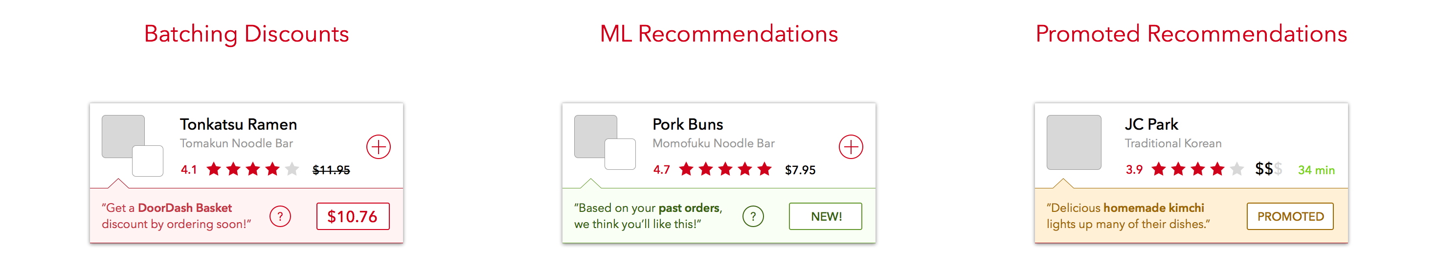
A lot of interface design can be broken into system design — creating elements of functionality that can be composed and re-applied in different contexts, all working harmoniously without redundancy. How do you design these system components and make sure you can apply it wherever you need it? Here, each recommendation presents an item or restaurant (using the same elements from search), an explanation for why it’s being presented, and a badge that shows more information (like the discounted price) or an identifier of what type of recommendation it is.
To the left, you can see how you can scroll through these recommendations, and also see category recommendations at the top of the search homepage. You can drill down into a listing of all the categories, and see even more recommendations by tapping at the bottom of each section. When you drill into a category, you’re presented with a search on just the given category. On the right side of the navigation bar, you can access your faved restaurants for easy ordering.
The search homepage is the starting point of all orders, so it has to accommodate both overarching contexts with which it’ll be used: specific searching and imprecise browsing. By offering this gateway that can guide with recommendations and assist searching with easily adjusted filtering, I hope this discovery experience can help prop up that first step in the search-order-eat experience that DoorDash aims to provide.
#Sequencing and success metrics
One aspect of the product development process that designers often neglect to talk about is the sequencing of the building of their designs. How do we take a high level initial recommendation, like the one presented here, and translate it into a working product? A lot of that is about sub-dividing the large logical chunks into workable sets of changes that have corresponding dependencies. What I mean is that you need to understand which parts of the experience can be built out first because they don’t rely on other parts of the experience already existing. The easy first step for the set of designs from above is to build and launch reviews and feedback gathering first. To provide the data needed for signposting of restaurants and items, we need to build up a corpus of data, and releasing the mechanism to gather all that first, a few months to half year before releasing anything else, is absolutely necessary. Once that’s in place, rolling out a nicer search and discovery experience becomes a tractable problem that can be released in shorter intervals.
Another thing too often neglected during in the product design phase is a way of measuring the success of a solution. Some changes don’t necessarily require the tracking of a “metric of success”, but for many design decisions building off of an existing product, it can be a good source of intuition to base further changes on. For this project, the biggest metric I’d be looking to track would be average-time-to-order and an associated rating-per-minute-ordering . The designs suggested above are all aimed to get you food that you’ll enjoy in a timely-and operationally efficient manner. If we can reduce the overall average time to make an order, and increase the quality of those orders at the same time, then that would be a strong indicator that we’ve achieved what we set out to do.
#Caveats and conclusion
Doing design as a third party, even with access to a little bit of internal knowledge and data as I did, can be frustrating. This mode of operating, where these decisions are made from a place where inferences have to be utilized in place of the full body of data, are always going to be shadows of what a fully-integrated process would entail. It’s harder to work through different iterations and paths without the feedback (quantitative and qualitative) that is necessary to understand how to steer course. These are shots in a dim room, well intentioned, but necessarily lacking a fine clarity that’s derived from more iterations directed by shorter feedback loops.
On the flip-side, these kinds of exercises are useful for quick learning — taking this time over the last couple of days to work through a broadly-defined problem like this, has given me a sense of how DoorDash sees the world, and how it must operate and design. The company is in a special position, working on a hard infrastructure and operations problem, and in turn enabling an elegant ordering experience for its customer — all the while also providing a reliable and economical fulfillment experience for the restaurants it serves. The question I had to face was: how can we take this radical focus on efficiency, process design, & simplicity, and apply it to the previously lacking search and discovery experience?
And this article (and all the artifacts attached) is what I came up with. It’s just a start, iteration #1 in a long tree of attempts and explorations (if I had access and time to help the company in a more thorough capacity). The ideal design process would have been a tree of stops and starts, each built on knowledge gleaned from the last branch of attempts, and I didn’t have the access to data (quantitative and qualitative) needed to run that ideal process. That’s the kind of process we need to do great design: a series of small steps, well considered, all moving towards something a little better, with no fear to back track and say that an idea was wrong, and to reorient in another direction accordingly. Deciding, intentionally, how something should be and learning from every decision along the way.
Pixel by pixel, word by word.