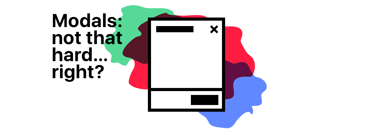
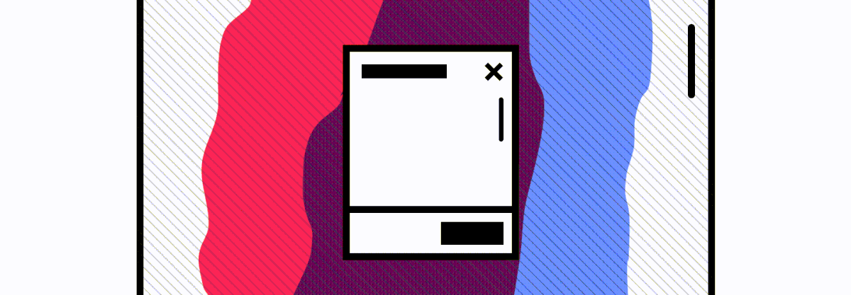
So. You’re building a design system for your company. It’s got everything that you would expect. Text Inputs! Custom single-select and multi-select fields! Buttons with every configuration option under the sun. And of course, the old standby: the modal.
While building a modal can seem simple from the start, there are a lot of cases and issues to discover once you release and iterate on it. And for us, we discovered a ton in the process of building a modal for our design system at DoorDash:
- We learned that z-indexes in content need to be managed in a consistent way
- We discovered that there are many accessibility considerations that need to be accounted for with modal contexts
- We found a gap in the way we tested our work, assumptions that were less solid than we thought, and unforeseen bugs because of it
So, here’s some stories (adjusted a bit from reality) that helped us learn how to build a modal.
#The z-index problem
Four days pass. You internally published your fancy reusable animated modal out as a package a couple of days ago, and it’s been pushed into production a few minutes ago—a coworker used it to rebuild the event sign-up experience. You get excited about seeing the thing out in the world, all the people RSVP-ing for all their fun events, and you smile a little. A moment later—
Support: We’re seeing some funky behavior when folks try to join an event after this latest deploy. Looks like event RSVP numbers are tanking, and conversion is in the single digits, but only on desktop web—seems like mobile web is unaffected.
Me: Weird.

Coworker: Double weird. I didn’t do anything different between mobile web and desktop at all…………… why would it break??
Support: From reports, it seems like customers are stumbling on filling out one of the fields—looks like it’s the one where they specify the number of people that they’re bringing with them. On desktop, people are clicking it, but they can’t see the options for number of guests—they click and it just doesn’t open. And they keep on clicking, according to the tracking on that thing.
Coworker: Wait but the dropdown didn’t change at all with my deploy*.* We just moved the existing content of the RSVP flow into the new modal. We’ve been using that same single-select dropdown since it came out in the design sys—
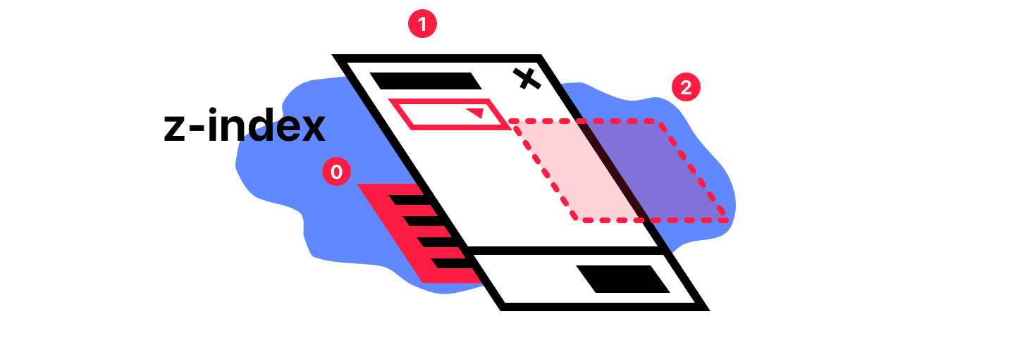
Me: Oh god, I know what it is. On mobile the single-select dropdown uses the native select renderer that pops up a system scrolling list. On desktop, we render our own custom dropdown. The dang thing probably has z-index conflicts with the modal. It’s rendering the custom dropdown behind the modal.
Coworker: z-index??? ****Classic.
#You need to know how to create and manage stacking contexts:
The stacking context is a three-dimensional conceptualization of HTML elements along an imaginary z-index relative to the user, who is assumed to be facing the viewport or the webpage. HTML elements occupy this space in priority order based on element attributes.
When you create a new stacking context, you ensure that elements that are children of that context cannot change their stacking behavior relative to other elements that are not in its stacking context. No amount of fuxing with z-index on a child in one context will make it stack differently against a child in another context. The only way to change the stacking between different contexts is to change the stacking behavior of the elements that created the new contexts.**
Within a stacking context, child elements are stacked according to the same rules previously explained. Importantly, the z-index values of its child stacking contexts only have meaning in this parent. Stacking contexts are treated atomically as a single unit in the parent stacking context.
So how would knowing about these concepts work out in the context of our Modal?
This is how you prevent issues of modal content, application content, and the modal itself causing issues:
#Takeaway: Know how to create new stacking contexts for application content and modal content, so that messing with z-indexes values in either doesn’t cause content to appear above or below what it’s expected to.
A demonstration:
Here’s a little demonstration of how stacking contexts work. Play with the code at https://codepen.io/ryngonzalez/pen/zPBBBL to understand what’s going on.
The point being: since you can anticipate that there will be components that use z-index for layering in your modal content, you can create a new stacking context for that content to ensure that those elements in the modal content container with z-index only display above or below items in the modal content context.
At DoorDash, we use a LayerManager component that uses [react-gateway](https://github.com/cloudflare/react-gateway/) internally to ensure that Modal content is rendered into a different stacking context than application content—so no matter what you stick into a modal, or whatever z-index you put onto a something in application content, the Modal will render above it—no crazy layering issues because stack order is guaranteed.
#Managing the focus state of your application
Six months pass. You get a Slack message from user research.
Me: “We did that badly on the usability test!?”
User Research: Yup. We went through the ADA guidelines audit, and it seems our keyboard accessibility is pretttttttty bad. Among other things accessibility-related.
Me: Really? I put focus states on all of our components, and try to make sure we’ve got the right tabindex properties our interactive elements. What went wrong?
User Research: Looking over the notes from the session, it seems like the biggest culprit is that in any of our modals, when they’re first opened up, tabbing doesn’t change focus into the modal. When folks try to tab around, they end up having to tab through a bunch of page content, stuff that should be hidden/obscured by the overlay, before they’re able to actually interact with and use the modal itself.
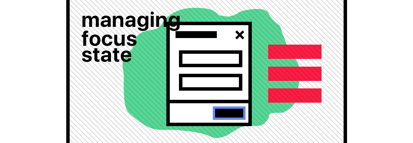
Me: Oh boy. I think I missed this completely when I was working on this… Time to go brush up on modal accessibility.
Wait. Where can I learn how to do this correctly?
#The WAI-ARIA documentation and examples are your friend
If you’re not familiar with what WAI-ARIA is, I’ll let their intro explain:
WAI-ARIA, the Accessible Rich Internet Applications Suite, defines a way to make Web content and Web applications more accessible to people with disabilities. It especially helps with dynamic content and advanced user interface controls developed with Ajax, HTML, JavaScript, and related technologies.
If you want to know how to build accessible applications and websites, those docs are the first thing you should read. They describe so many of the expectations for how modal dialogs (their parlance for the modal component) should work for accessibility: how they should be labeled for screen-readers, what keyboard shortcuts should be expected, and of course, how focus should be managed when you enter and exit a modal.
While the WAI-ARIA docs are a great resource, the Mozilla docs on dialog accessibility do a great job condensing the guidelines for focus management:
A dialog has particular requirements for how keyboard focus should be managed:
1. Dialogs always need to have at least one focusable control. For many dialogs, there will be a button like “Close”, “OK” or “Cancel”. Besides that, dialogs can contain any number of focusable elements, even entire forms or other container widgets like tabs.
2. When the dialog appears on the screen, keyboard focus (whose control depends upon the dialogs purpose) should be moved to the default focusable control inside the dialog. For dialogs that only provide a basic message it could be an “OK” button. For dialogs containing a form it could be the first field in the form.
3. After the dialog is dismissed, keyboard focus should be moved back to where it was before it moved into the dialog. Otherwise the focus can be dropped to the beginning of the page.
4. For most dialogs the expected behavior is that the dialog’s tab order wraps, which means that when the user tabs through the focusable elements in the dialog, the first focusable element will be focused after the last one has been reached. In other words, the tab order should be contained by the dialog.
#Main takeaway: ensure that focus when tabbing while a modal is open is to focusable content
You can see some of the behaviors in the list above in this lil’ animation:
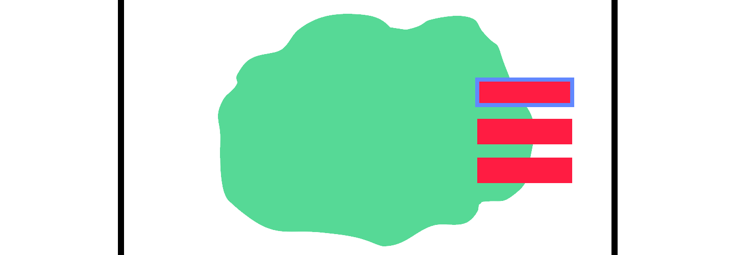
One thing to note: this behavior is not something you get for free if you’re using aria-role="dialog" —you, as the application developer, need to implement this focusing behavior yourself or have a library do it for you.
All the quirks of a managing focus with modals can be tricky to enumerate and consider, and are certainly not something you want folks to re-implement every time you just need a modal to get people to put stuff in their cart. On that path is madness, alongside the missing of many, many edge cases.
Luckily, we can make sure that, with a standardized dialog modal from our design system, no matter what, the focus management can be applied and no one has to worry about re-implementing it again. And with some handy libraries, implementing it the first time is easy to read and understand. If you’re just using straight vanilla JavaScript, it’ll look something like this with [focus-trap](https://github.com/davidtheclark/focus-trap)!
focus-trap is a small library that will manage saving the last focused element, finding and focusing on the first focus-able element of the modal, keeping focus within the modal, and restoring focus to the last focused element once the modal is unmounted.
You can see some an example of how to use it here:
var createFocusTrap = require("../../")

var containerOne = document.getElementById("demo-one")
var focusTrapOne = createFocusTrap("#demo-one", {
  onDeactivate: function () {
    containerOne.className = "trap"
  },
})

document.getElementById("activate-one").addEventListener("click", function () {
  focusTrapOne.activate()
  containerOne.className = "trap is-active"
})

document
  .getElementById("deactivate-one")
  .addEventListener("click", function () {
    focusTrapOne.deactivate()
  })
For DoorDash, we use [focus-trap-react](https://github.com/davidtheclark/focus-trap-react), a light wrapper around focus-trap that makes it easy for us to integrate into our modal implementation. No matter what, our modals will do the right thing for keyboard users.
#The scrolling annoyance & the curious viewport
It’s been a week and a half. Among the daily batch of JIRA tickets that somehow ends up in my inbox, a short but sweet one from our designer looks like this:
DLS-124: Scrolling to bottom of modal scrolls to bottom of page
*Description: When using the add-item modal, when you scroll to the bottom, continuing to scroll causes the background content of the page to keep scrolling until you hit the bottom. It’s a bit annoying.*
In my head I’m thinking:
#Ugh, that is annoying. I should fix that soon.
So, I went to work.
Investigating a few options from other modal implementations for locking the scrolling of the page content when a modal is visible was a normal task that people seemed to handle in fairly straightforward, mundane ways. As simple as tossing an overflow: hidden on the document.body, right?
Not quite.
[DLS-147] Scrolling within a modal on mobile can get content in a weird state > *Description: We started using the modal for confirming your contact information when you log in; people get stuck because the confirm button, that you’ve is supposed to be fixed to the bottom of the viewport, is hidden behind the navigation controls. So customers try to scroll to move forward, and then things get weird—they don’t actually get the confirm button to show up where they can click it, but they end up scrolling the content of the page behind the modal. They can see the page scroll bar move, but nothing visible (even the actual content of the modal) actually moves with it.*
So, I guess this is two bugs!

What!? Why is the button outside of the viewport, behind those controls? And I thought I handled the page content scrolling? Ugh, this is getting tricky…
I dug in. There were three real problems:
#1.
We made an assumption that viewport height units would just work, in all contexts—that if you set a modal to the full size of the viewport, it would ensure that the content and controls of the modal would always be visible. Unfortunately, the definition of in-view is hard to pin down, especially on mobile.
There’s a great survey on GitHub of the mobile browser landscape in regards to how they treat the viewport in relation to the browser’s navigation controls. I would read that to really understand how
The mobile browser URL bar is such a pain! It interacts with the page in a different way in every browser. This page hopes to explain the nuances of how the URL bar affects the web page, document the differences between the browsers, and explain some proposed recent changes to Chrome to improve the current situation.
Nicholas Hoizey has an excellent writeup on this issue, which surfaced this explanation from a contributor on Safari:
This is completely intentional. It took quite a bit of work on our part to achieve this effect.:)
The base problem is this: the visible area changes dynamically as you scroll. If we update the CSS viewport height accordingly, we need to update the layout during the scroll. Not only that looks like shit, but doing that at 60 FPS is practically impossible in most pages (60 FPS is the baseline framerate on iOS).
It is hard to show you the “looks like shit” part, but imagine as you scroll, the contents moves and what you want on screen is continuously shifting.
Dynamically updating the height was not working, we had a few choices: drop viewport units on iOS, match the document size like before iOS 8, use the small view size, use the large view size.
From the data we had, using the larger view size was the best compromise. Most website using viewport units were looking great most of the time.
So, to handle this issue, we ended up accounting for the specific amount of pixels hidden by the Safari navigation controls using css calc—we could ensure that our content is always visible, and that there would be no situation where something you expect to be available to the user is blocked off.
#2.
overflow: hidden isn’t sufficient for preventing the body content from scrolling. On iOS, there are only two reliable ways of doing this: Setting position: fixed on the document.body, or adding event listeners that prevent the default behavior of touchmove on the body content. And because the tradeoffs of short-circuiting touch events seemed too problematic for use in our modal, we went with the position: fixed body content.
#3.
We only tested the modal for mobile using the responsive testing mode on Google Chrome. We didn’t use actual devices, and in the process, missed out on the issues above—we didn’t have the right tools in place to ensure we could see the issues the modal had.
It’s hard to anticipate a certain class of problems unless you’ve been through them before. There are edge cases that are easy to overlook when you think things are certain — and the way through is to be confident in strategies to gather information, test your stuff, and uncover problems. Design systems, for all they are in technology, are also about processes: the way we anticipate problems, investigate the design and technical tradeoffs, and distribute those solutions more broadly.
And in this case, for these problems, there was a gap in how we were working. The process of testing our designs, on actual devices, and making sure the assumptions we felt were incontrovertible were actually true in practice was missing, and the gaps showed*.*
So the lesson: Always test with real devices. Always test your design in the real contexts that they’ll be used. You’ll be surprised at all the little things that you didn’t consider, and you’ll iterate accordingly.
#The Takeaways
So, what did we learn?
#Consider modal accessibility from the start
Test your accessibility, with different browsers, desktop and mobile, and with screen-readers. Understand how keyboard users, non-visual users, and other folks will use your modal—accounting for all those use cases and setting up your product teams for success from day one will pay enormous benefits in the long run.
#Know the content that modal will contain, and guard for edge cases
The z-index issue is one of a class of issues that is mitigated with research and planning: anticipate how your components will be used, and figure out their pain points—as a component that will used in a layering context, understand and anticipate that you’ll need to account for uses of layered components both in application content and in the modal content itself.
#The system is made of processes as much as components
Open yourself up to look beyond the components themselves, but the way they’re made, the way they’re tested, and the way issues are discovered. As we saw with the mobile scrolling issue, we needed better requirements around testing all of our assumptions, on-device, so that we could’ve seen the issues around mobile sooner, and learned that our assumptions were not as rock solid as we thought they were.
#Make your component a tool to distribute best practices
Building a design system helps aggregate good decisions, account for tricky & elusive bugs, and ensure that the lessons we learn through building can be archived and reused again and again, with minimal effort. Accounting for how modals work on mobile, how they ensure background content doesn’t annoyingly scroll, how we enforce that they’re accessible—a shared component in a design system, with the appropriate API and documentation, can provide us a tool to allow product developers & designers to focus their thinking at a higher level of abstraction. We consider how we shape the product and all its facets, rather than focusing on the UI focused decisions that don’t need to change, and can take an inordinate amount of time to get right, again and again.
That’s all. I hope you enjoyed it—and I hope this helps you consider the things that aren’t so intuitive about building a modal so you can provide a great tool to your developers, and to the users they’re supporting.